A visual and strategic shift that centers people, life, and the real impact of Until’s technology.
Few fields are as confusing as cryopreservation. The world still sees it through a sci-fi lens, frozen labs, chrome rooms, distant futures.. when in reality, it’s grounded in modern healthcare.
It helps cancer patients recover with bone marrow transplants, it gives people going through IVF more control, and soon, it will make donor organs last long enough to reach people who need them. That’s the part no one talks about, and that’s exactly where Until Labs comes in.
Even though cryopreservation has long carried that futuristic aesthetic, it’s more a matter of public perception than the field itself. The science isn’t cold, it’s simply been framed that way culturally. And Until needed an identity that reflected who they truly are: a healthcare company built around people, care, and real medical impact.
When Science Outgrows Its Own Aesthetic
When the Until team first met with us, they were still operating under their previous name. The brand was functional, technical and, to their credit, enough to get going in the early days. But it framed them as a small lab hacking its way forward, rather than the healthcare company they were becoming.
The team was scaling fast, their research was gaining traction, and they were doubling headcount while recruiting globally. And suddenly, the old aesthetic felt like a mismatch: too cold, too clinical, too “future-tech,” not enough people.
It all came down to one thing: they were ready for the world to finally understand what they actually do: help people today.
The hardest part of this project wasn’t the logo, or the palette, or the website. It was understanding how to talk about science without diluting it, and how to express emotion without slipping into sentimentality. Cryopreservation isn’t inherently cold, we just made it look that way.
Until’s request was beautifully simple: make the brand feel alive. Literally.
The Elements Behind the Feeling
The emotional shift wasn’t accidental, it was intentional.
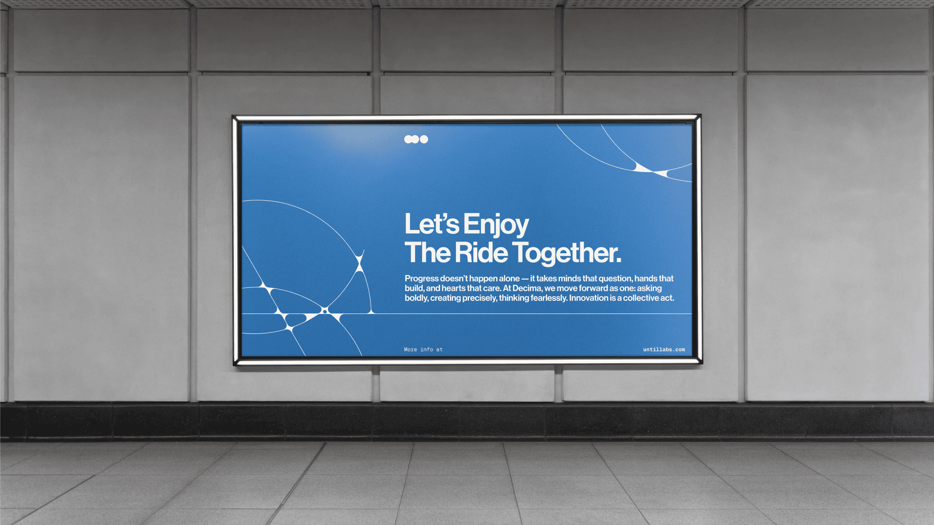
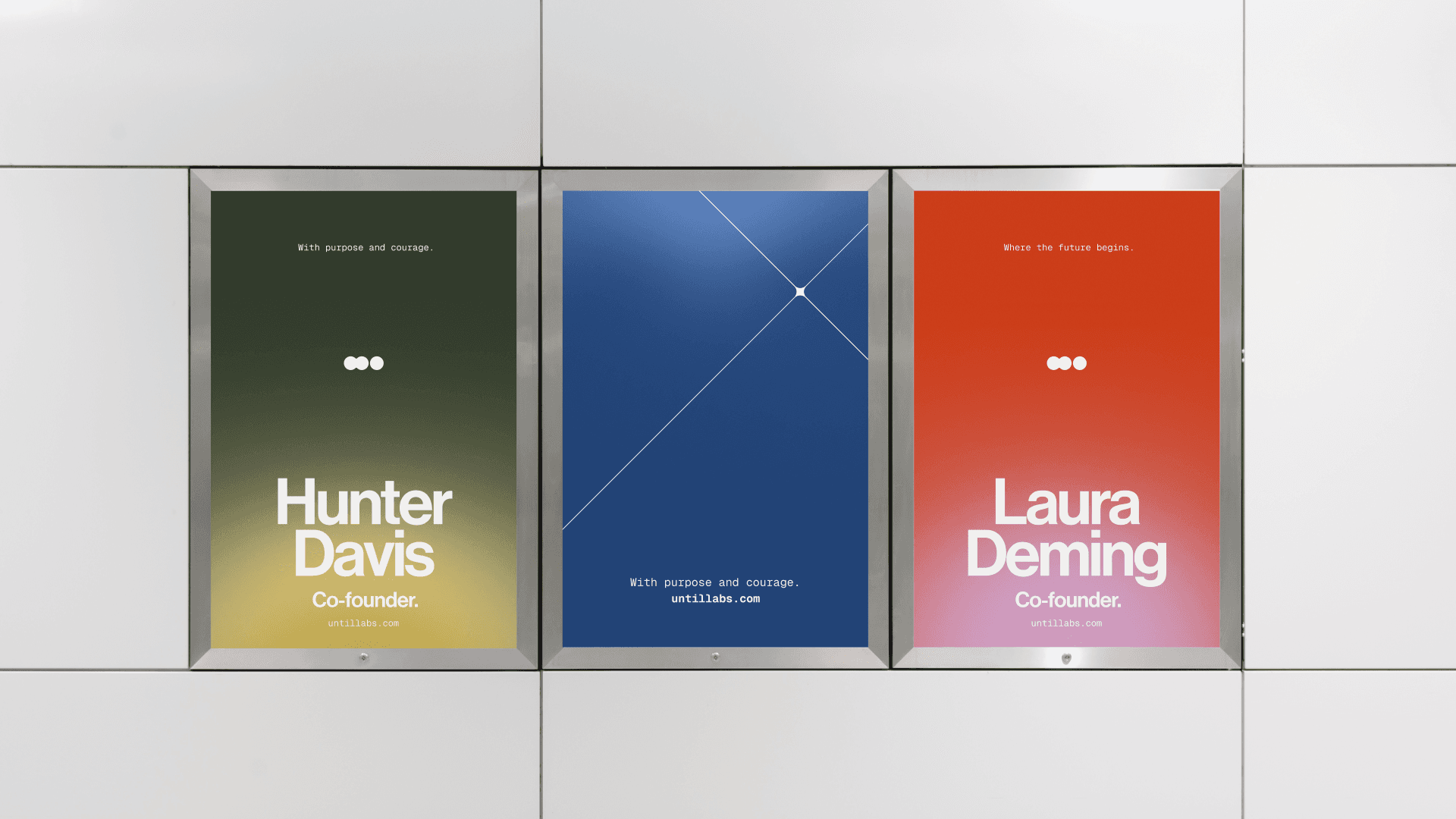
The Logo
We built the mark around the idea of an abstraction of a molecule slowing down or speeding up. A minimal, molecular form that captures both the complexity of life and the precision that defines Until.

Gentle curves soften the scientific rigor, making the symbol feel human, intentional, and alive.

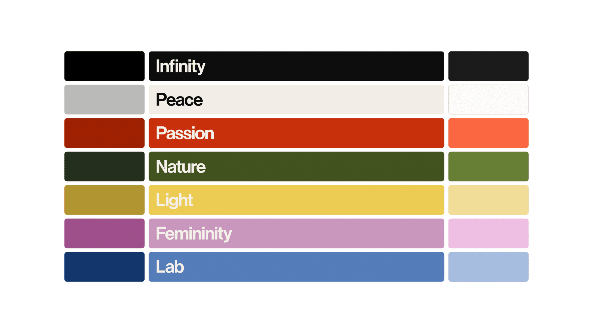
The Color System
Anchored in off-white, black, and a warm orange, the palette balances clarity with warmth. Supporting tones - infinity, peace, passion, nature, femininity, and the quiet discipline of a lab - expand the emotional range. The result: a system that feels calm, grounded, and quietly optimistic, while also giving the team the extensive color flexibility they need for complex scientific diagrams and plots.
Typography
Neue Haas Grotesk Pro gives the brand its core voice: modern, confident, legible. Its Text counterpart carries longer stories with ease, while Geist Mono introduces the structured precision needed for scientific data, dates, and numbers. Together, they’re clean and credible.
Illustrations
Built from continuous lines and softened corner radii, the illustration language feels precise yet approachable. These organic geometries add a gentle character that mirrors the molecule at the heart of the brand.
Gradients
Inspired by molecular motion, our gradients embody fluidity and the natural irregularity of life. Soft transitions. A sense of warmth. Light moving through space.
Imagery
Until photography is a visual echo of the rewarming process. Images are treated with soft grain, gentle blur, and warm light to evoke the sensation of something quietly waking up: the sun through leaves, a hand reaching, the quiet motion of life resuming.
Rather than literal depictions, we lean into feeling. Each image should belong to a shared metaphor: one of presence, vitality, and the joy of life lived fully. Even when the subject is abstract or unseen, the mood should be unmistakable: peace, warmth, movement, and transformation.
But the system also needed to honor the people behind the science. Until wanted to spotlight their interdisciplinary team, scientists and engineers working side by side in a way that’s rare in this field.
A Collaboration Built on High Standards
Working with scientists is a particular kind of joy since they care about precision the way designers care about craft. Every detail matters, every word matters, every pixel, curve, and transition needs to be grounded in purpose.
For the homepage we created an immersive, highly detailed scrollytelling experience for Until Labs: an interpretation of the iconic Powers of Ten video reimagined through a contemporary scientific lens. The narrative zooms in and out of life itself, revealing how every “precious moment” is part of a vast, interconnected system. By moving fluidly between scales, from the intimate to the microscopic, the experience reinforces a simple but powerful idea: everything is alive, everything is in motion, everything matters.

To bridge the emotional human world with the precision of science, we introduced a Gaussian splatting visual treatment. This effect became the perfect hybrid: it carries the technical sophistication of computational imaging while evoking a subtle, almost post-impressionist softness. The result feels both analytical and poetic. It transforms raw data into something tactile and alive, something that mirrors the essence of the brand.

This combination made the story not just visually compelling but conceptually coherent. It elevated the human side, softened the scientific rigor, and ultimately made every scene feel more special, more intentional, and more beautifully interconnected.
Most rebrands try to look more sophisticated, Until’s rebrand aimed to be more understandable.
Not to impress investors, though it helps. Not to win awards, though it easily could. But to speak clearly to the people who rely on (and work within) this science:
• researchers
• clinicians
• transplant specialists
• patients
• future hires
• partners building responsibly
In short: the ecosystem that will actually bring this technology to millions.

The brand now communicates three things instantly:
- This is putting humans first.
- This is science at its best.
- This is real.
That clarity is the true business impact.
The folks at basement made our creative vision a reality, their skill and artistry made it even better than we could have imagined.
Katherine Baney
Comms Leads
Why This Work Matters
We don’t usually get sentimental about rebrands. But this one is different, because the stakes are real. Every design decision ladders up to a single idea: Cryopreservation is not about delaying life, it’s about giving it back.

If the brand can make someone feel even one moment of relief, curiosity, or trust, it’s doing its job. And if it helps Until recruit the people who will scale this science to organ preservation, then it’s doing far more than that.
This identity isn’t a finish line, it’s a foundation. As Until continues to expand into new applications, refine the science, and build partnerships across healthcare, the brand will flex with them: precise when necessary, warm when it matters most, always human.
Because some technologies don’t need to feel futuristic. Some need to feel like hope.


