How Speakeasy and basement teamed up IRL, driven by a shared ambition to get it right. Built to scale, powered by proximity. This is what happens when both teams show up—literally.
Some teams click. Same pace, same standards, same obsession with getting it right. Speakeasy was one of those teams. The only difference? This project started with a plane ticket. Faraz, Speakeasy’s Founding Design Engineer, flew from the UK to our studio in Mar del Plata. Two weeks on-site.
We weren’t from the same place, but this team magically connected. We met, we jammed, and by the end of day one, it felt like we’d been building together since forever.
In a post-COVID world, in-person collaboration felt like a throwback—maybe that's why we gravitated toward those old-school terminals and vintage Apple aesthetics. Walking into Basement's studio, surrounded by details like rare Japanese N64 boxes, I knew this was a team that shared our standards. We pushed each other to craft something that would make people feel something, not just see something. I think that shared obsession shows in what we built together.
Faraz Khan
Founding Design Engineer at Speakeasy
part of the @basementstudio team working hand by hand with @farazKhan404 for @speakeasydev

We didn’t start with a logo or a color palette. We started with this question:
How do you build a brand that not only looks good but also scales with the product, aligning with Speakeasy’s future ambitions? We wanted to design something that could live inside the product, not just hover on top of it.
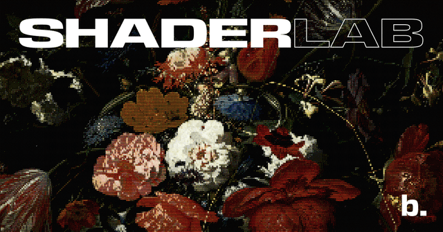
Speakeasy is for engineers who obsess over their craft. So the brand needed to reflect that kind of thinking: sharp, minimal, modular. Serious about clarity, but never cold.
We called the final brand concept: Refined Tech. Elegant, but not decorative. Every detail earned its place, so we started pulling threads. There was something about old-school terminals and gadgets that caught our eye, and a clear parallel between Japanese minimalism and the company's mechanical precision.
We explored. Pushed. Ditched a few ideas that were good but not right. The Figma Exploration file at one point was pure chaos, but the chaos we needed.

When the mark finally moved the way it should, we knew we were there.
Defining the system together meant aligning on a few core principles: generous whitespace for clarity and elegance; a serif typeface that brings warmth and nods to early Apple Macintosh ads; and a monospace typeface to support technical content and reflect the developer mindset behind it all.
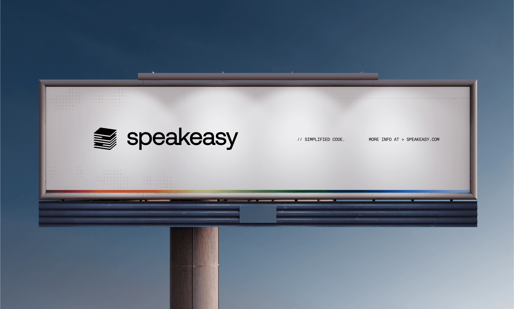
We used pixel patterns as a visual metaphor for the complex environment Speakeasy transforms into clarity, a visible grid to bring structure to all the information they wanted to share, and an RGB gradient line—enough spark to break the grayscale and keep things gracefully bold.
The logotype itself tells the story: stacked layers, modular structure, an abstract API. We fine-tuned spacing for light and dark modes, adjusted sizing for smaller surfaces, and built everything around the “S” as the anchor. It’s designed to behave: quiet when it needs to be, iconic when it stands on its own.
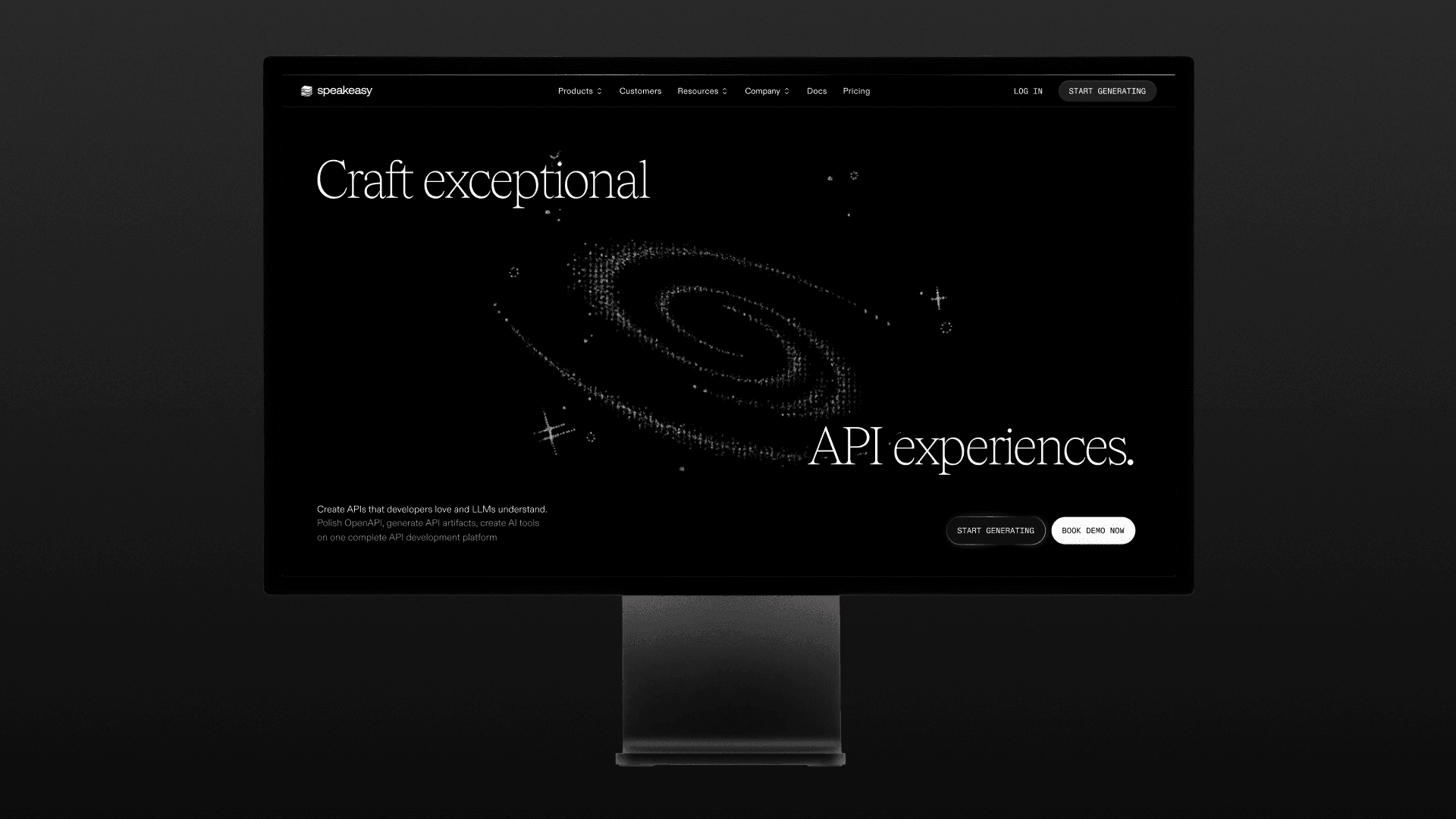
The site followed the same logic: clean, fast, and a little bit playful.
We didn’t want it to talk down to developers—or drown them in buzzwords. It needed to feel intuitive, showing rather than telling. We pulled in product UI, used typography that felt tight but unforced, and added a few nods to dev culture, ASCII touches, micro-interactions… Small touches that show real care.
No scroll-jacking. No loading gimmicks. A thoughtful site with real utility.
The best part of those two weeks wasn’t a single breakthrough. It was the rhythm. Between work sessions, we gave Faraz the full basement experience: fútbol, asado, mate, and long talks about music, design, and modular code. The kind of time that doesn’t make it into a project doc, but always makes it into the work. When you share a space with someone, things move differently. It’s not necessarily faster, just better.

And that’s what we got: two weeks of momentum and a shared foundation to keep building on.