See how this ethos came to life in the particle shader effect we created for Vercel Ship.
For this year’s Ship event, we joined forces with Vercel's brand team, aiming to explore the world of particles. Our mission? To create an engaging (and performant!) experience where the Ship logo breaks into particles that gravitate towards the mouse.
How it Started
Our 3D team started experimenting with letters built out of particles and sent this preview. Collaboratively with the Vercel team, we put together a proof of concept that breaks the logo into particles that can be moved with the cursor.
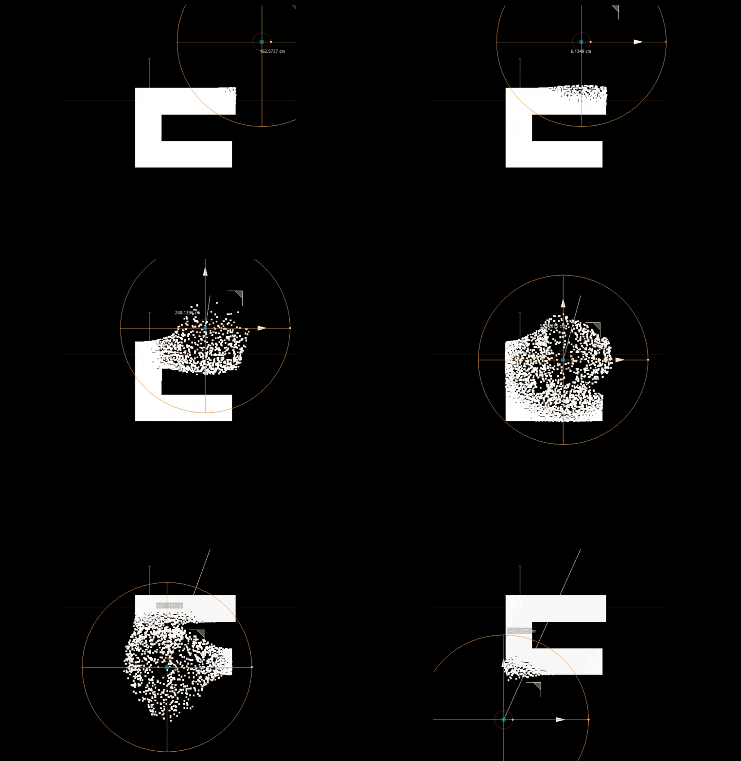
After this experiment, we knew this was the correct path. We wanted a light and simple framework to work with particles, so we decided to use Regl as our WebGL framework.
Implementation
To achieve this effect, we created a grid of particles that will move when the mouse is close to them.
These particles will also render the texture of the logo and the button, and when they start to move, they turn into small dots.
Let’s scale the effect to see what is happening:
We wanted the particles to behave differently in different parts of the screen. For example, we don't want the particles at the center of the button to move:
But how does each particle know if it can move and how much? One way to easily relay this information is to encode it into a texture. Each particle will sample this texture at its position and use each channel (RGB) to decode how much and where it can move. We called this texture baseFbo.
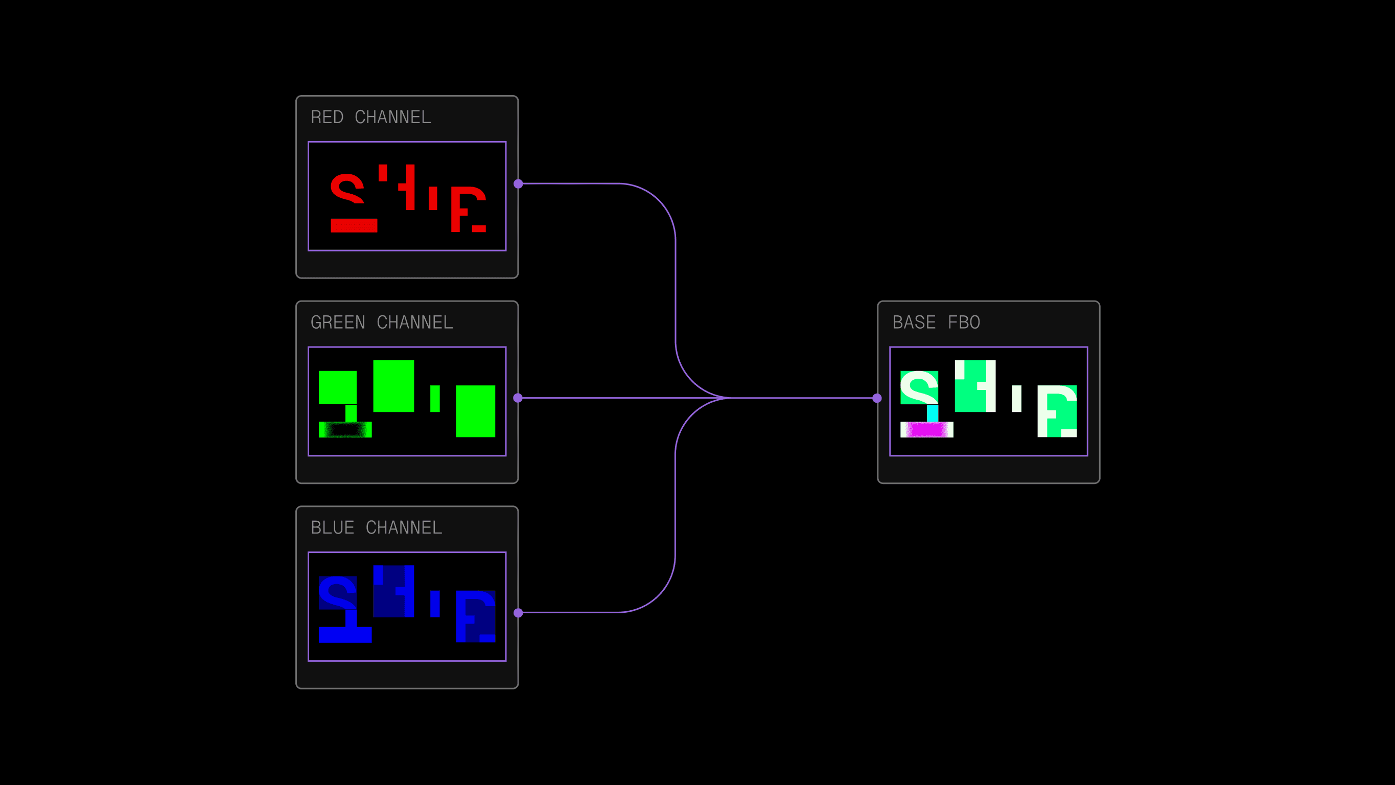
The red channel serves as a texture for both the logo and the button. In other words, wherever baseFbo is red, the particle will appear white.
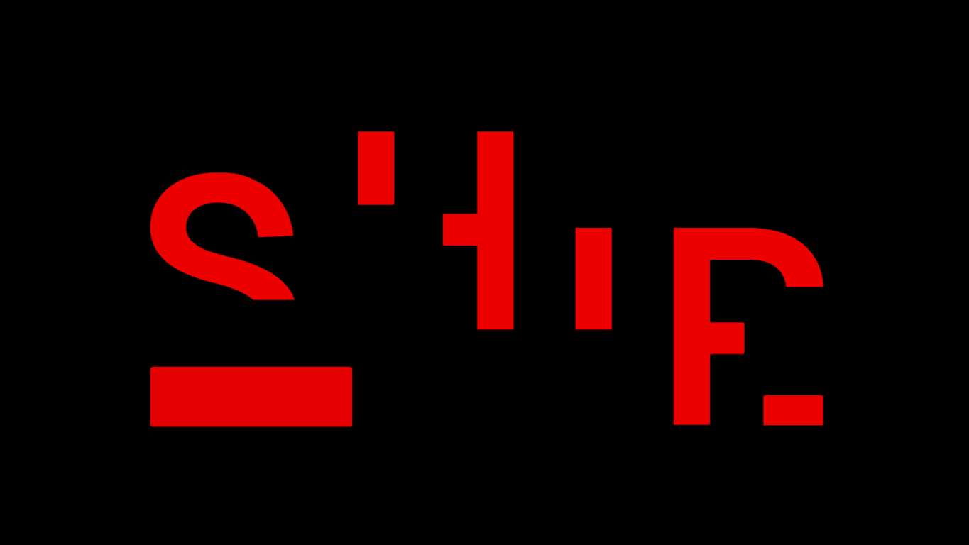
The green channel determines how much a given particle can move; this is especially useful to disable the effect on some parts of the hero.
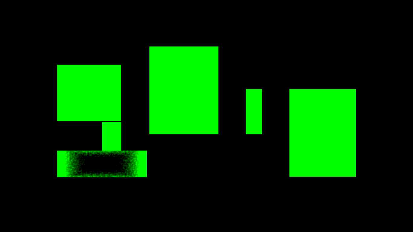
Note
Notice how the center of the button is not green, so the particles there won't move.
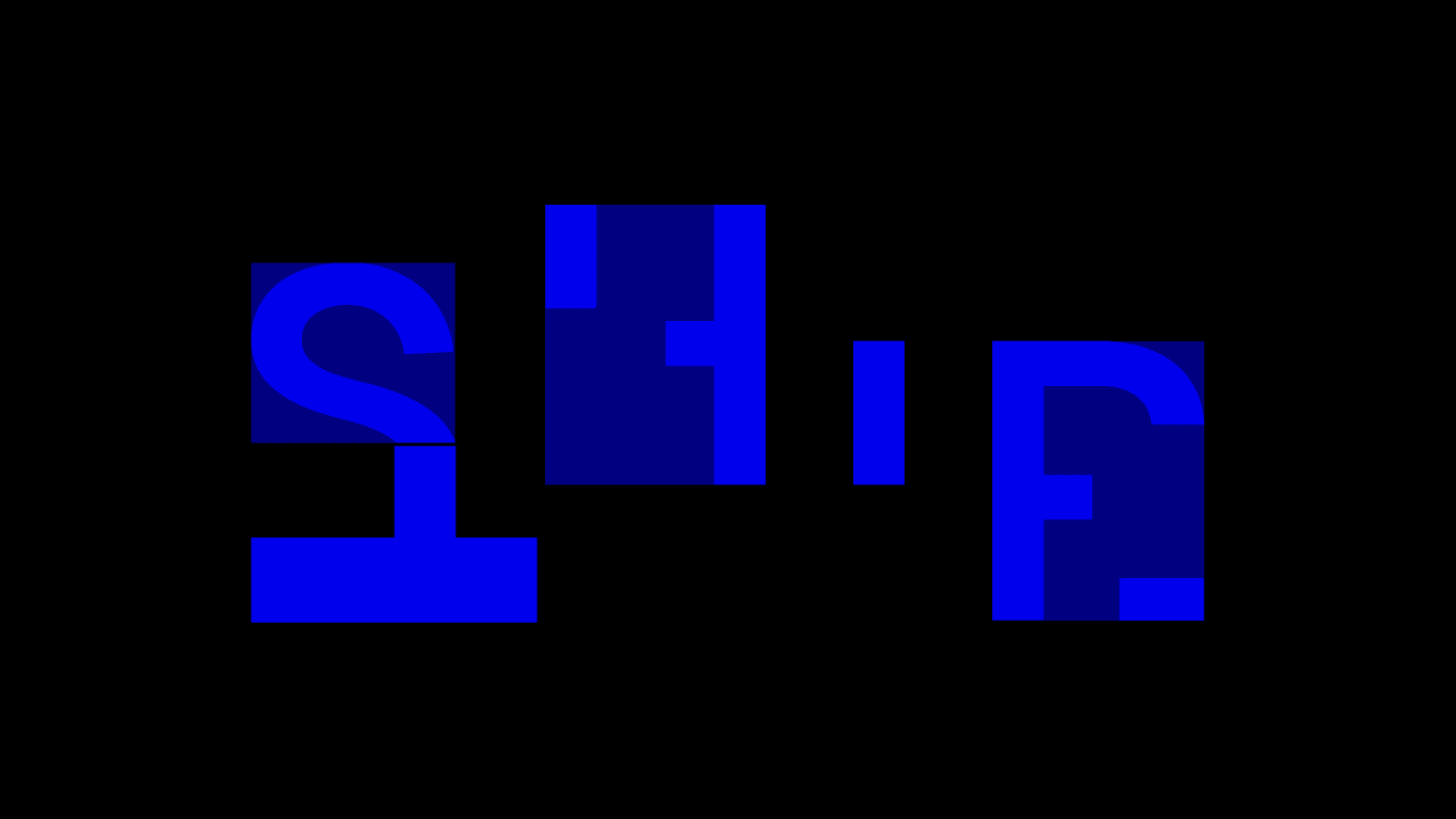
An issue we had to solve was breaking the illusion that you are moving a circular mask over an image, so we used the blue channel to allow the effect to grow in that area. The area of the magnet grows along the path and does not jump directly into an unconnected section.

Note
Notice how we added a “bridge” between the S and the button, so if your mouse is in the middle, both elements will move.
Cursor Gravity
We want the particles to gravitate towards the mouse and slowly return to their original position. To achieve that, we created a flow shader that stores information about mouse movement.
We used the red and green components to store the direction from the pixel to the mouse. This could also be achieved with a simpler calculation (PixelPos - MousePos), but we wanted the position to have a fade out so the particles don't move 1-1 with the mouse. If a particle is already moving, it will change its direction slower than a static one.
The blue component of the shader indicates how much the particles should move. That factor is later combined with the baseFbo and the direction vector to calculate where the particles should land.
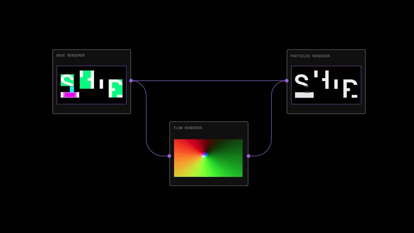
Here are all the shaders working at the same time:
The final combination of the buffers looks like this:
Optimizations
We wanted the site to load instantly, so waiting for the hero shader to be ready wasn’t an option. To fix this, we first animated the letters using SVG while the particles loaded, and when the effect was ready, we switched the SVG with the canvas.
We had to implement antialiasing to the letter texture so that the switch was not noticeable. If we zoom in on a letter, we can tell when the switch is happening.
Shipped!
Creating this simple effect was an awesome experience that allowed us to experiment with Regl, particles and optimization tricks.
Take a look at how the Vercel team made the dropping lanyard for the Vercel Ship 2024 site.


