Gradients have been here from the early days of the web and still rock. The key is knowing how to use them. So, let's dive into the magic.
Gradients are Cool
Gradients are like a magic show of light, physics and colors. While incredibly versatile, they can present a slight challenge when it comes to handling. This involves skillfully melding various distinct hues with unique shades, brightness, and saturation levels. Additionally, the intricacies of screen display, rendering dynamics, compression nuances, and other related factors must be considered.
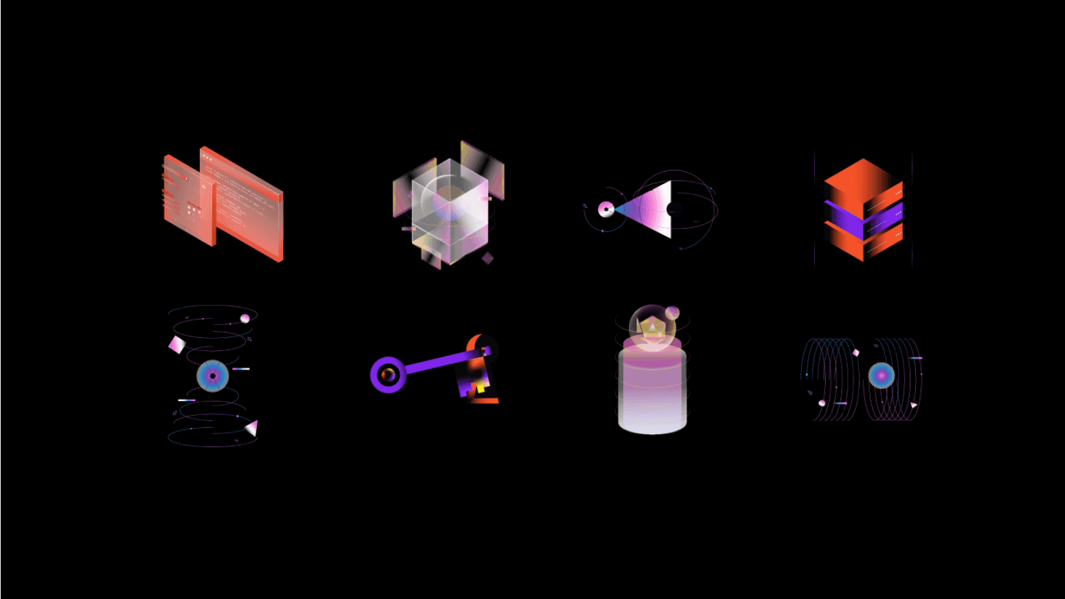
Gradients by Relbaum
At basement, gradients hold a special place in our hearts. We use them all the time, whether we're working on illustrations or web design. That’s why we've compiled a collection of handy tips to empower you to master the art of color selection and overcome the various challenges that may arise.

basement gradients on website
The tricky part: picking colors
Want to nail gradients? The crucial factor lies in choosing the correct colors. It's not just about blending two random colors together. Sure, a lot of it is trial and error, and sometimes, you just gotta trust your gut. Yet, having a grasp of color theory or using the right tools can significantly enhance the process.
Don't sweat it, though; we've got some great tips for you to play around with and get some cool results.
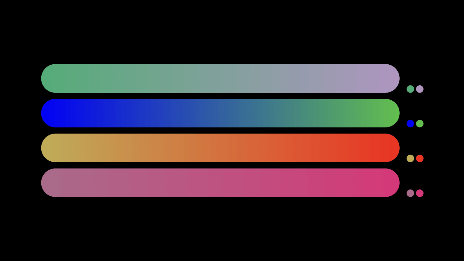
Two color gradients
Be smooth
Indeed, not all combinations of colors yield desirable results. Moving beyond preset values is one of the most effective strategies for creating exceptional gradients. Our goal is to get smooth transitions. For example, a gradient created with just two default colors may not achieve the level of smoothness you desire.

Two color gradient
Undesired abrupt leaps or discernible lines within your gradients are best avoided. The solution? Pop a similarly saturated color in the middle, and voila! You've got a smoother gradient. The secret lies in keeping uniform saturation across the values. That way, the blend looks better.
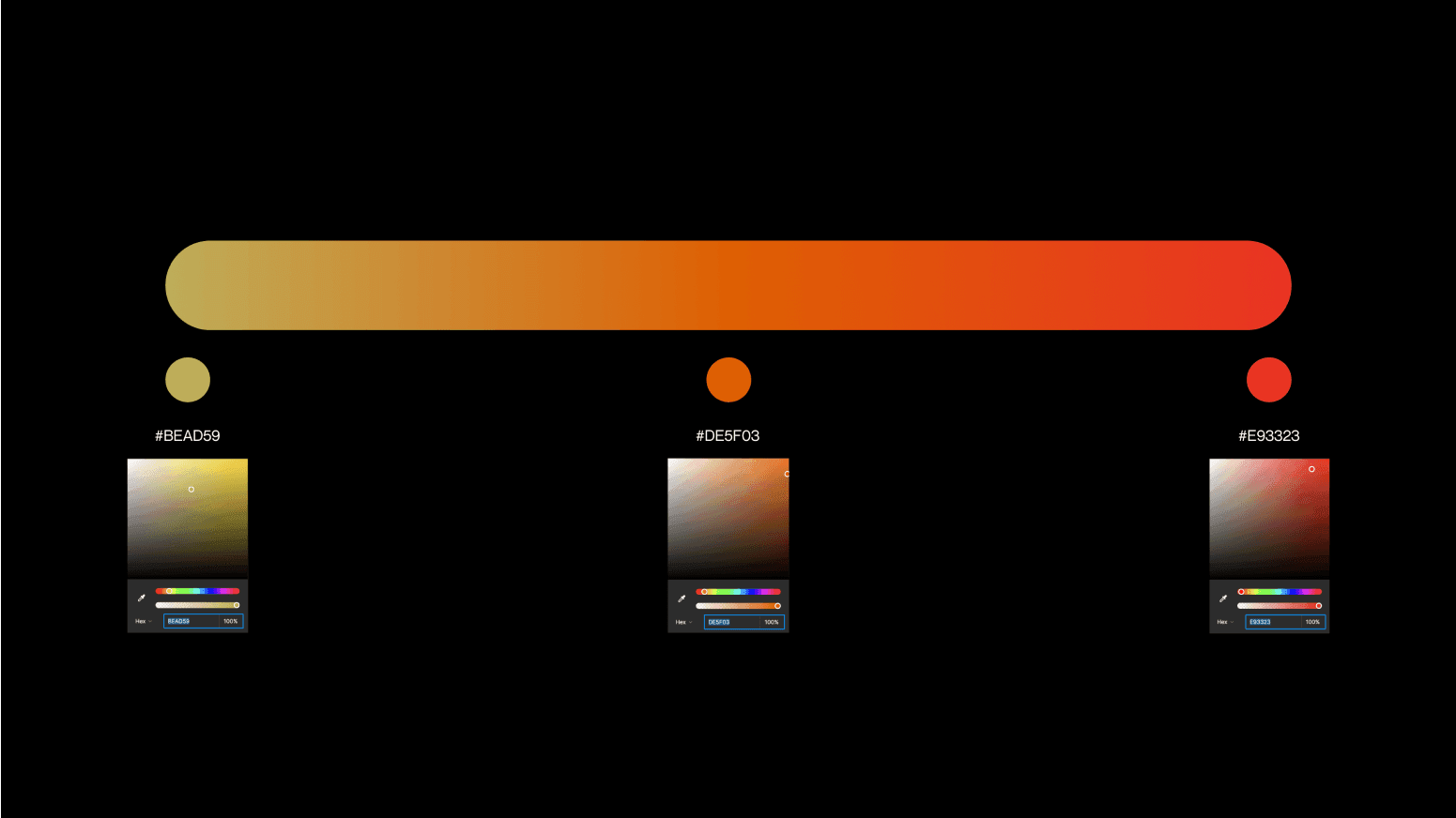
Smooth gradient
The color wheel
Another way to clearly understand how we can create smooth gradients is through the lens of the color wheel. When colors are closer, they tend to blend nicely. But what happens if we want to mix values that are pretty far from each other? In such cases, the inclusion of one or two intermediary colors comes to the rescue. You can play adding more values by tracing a path around the color wheel. Try it yourself!
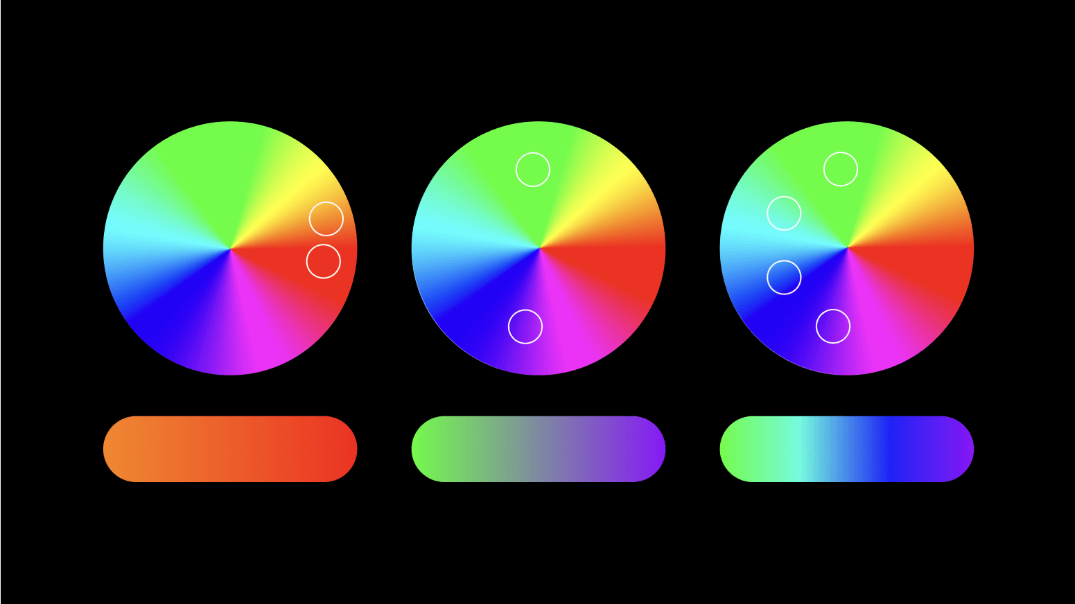
gradients from the color wheel
Looking for inspiration
Creating gradients can feel a little tricky at first, but don't sweat it - you're not alone. You can always look around for real-life gradients for inspiration or check out the tons of resources available online.
Nature is always the best source of inspiration. She is the best color picker on Earth, isn’t she? Have you ever caught a glimpse of the sky during sunrise or those magical golden hours? What a beauty to spark creative ideas.
As proof of this fact, we've put together a collection of snaps from our adventures in Spain, giving you a peek into the marvels that nature reveals.
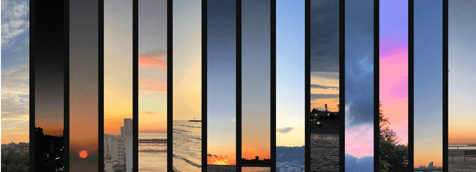
Sunset gradients
Alright, let's also give a shout-out to the internet, shall we? Gradients have gained immense popularity, and the web is packed with thousands of resources, tools, and tutorials to learn and get inspired. Sometimes, it's a good idea to check out a few of these spots to kickstart your creativity and then start experimenting on your own. Here are some links we've collected to get you started:
Let’s Get Started: The Gradient Tool
Let's dive into Figma's gradient tools. At first glance, they might all seem similar, but trust us, they can create all sorts of cool effects. To get the best results, it's crucial to set your creativity free and venture beyond the ordinary. Tweaking and customizing the settings can help you avoid those boring default gradients you see at first. But before we get into that, let's cover the basics. We have four types of gradient functions:
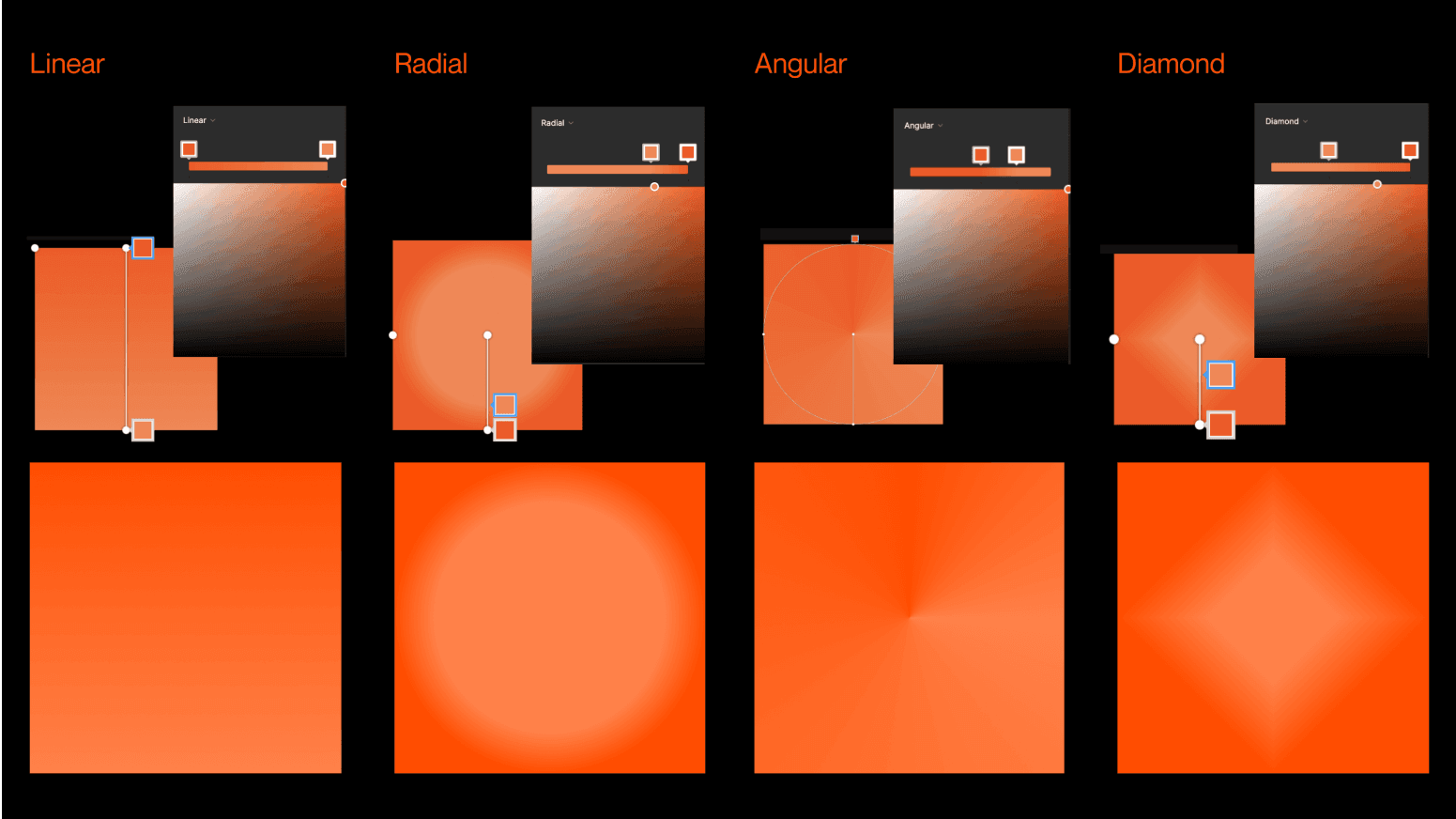
Figma's gradient tool
Linear: This stands as the most common gradient type. The colors flow in a single direction, such as from left to right, top to bottom, or at any angle you choose.
Radial: A radial gradient is defined by its center. Think of it like a target - it starts at a center point and gradually changes color as you move outwards. The final shape that forms can either be a circle or an ellipse.
Angular: Also known as a "conic" gradient, it is a bit like a color wheel. As the angle changes, the colors transform around a central point.
Diamond: Lastly, let's explore the diamond gradient. This one's born from the blending of two colors, starting from the center and extending outward to each of the four corners, resulting in a diamond or pyramid-like pattern.
Noise is the Key
Ever noticed those steps or bands disrupting the anticipated smooth color transition within your gradients? Well, that's what we call color banding or posterization.
It becomes noticeable when you're dealing with a blend of two closely related colors. Sometimes, it's triggered by the monitor's limited bit depth, while other times, it's related to compression or the bit depth of the digital image itself.
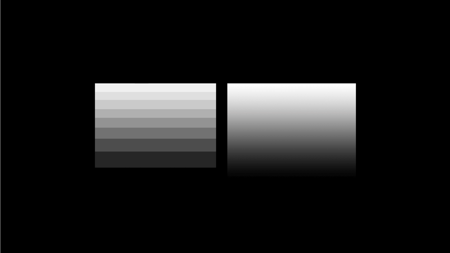
Posterization/banding effect
Putting some grain noise on the sauce is always a good solution. This technique transforms those harsh lines or bands you see into a stippled effect by tweaking pixel values. Dithering and noise techniques always help break up the visible banding effect, giving the gradient a better look and feel.
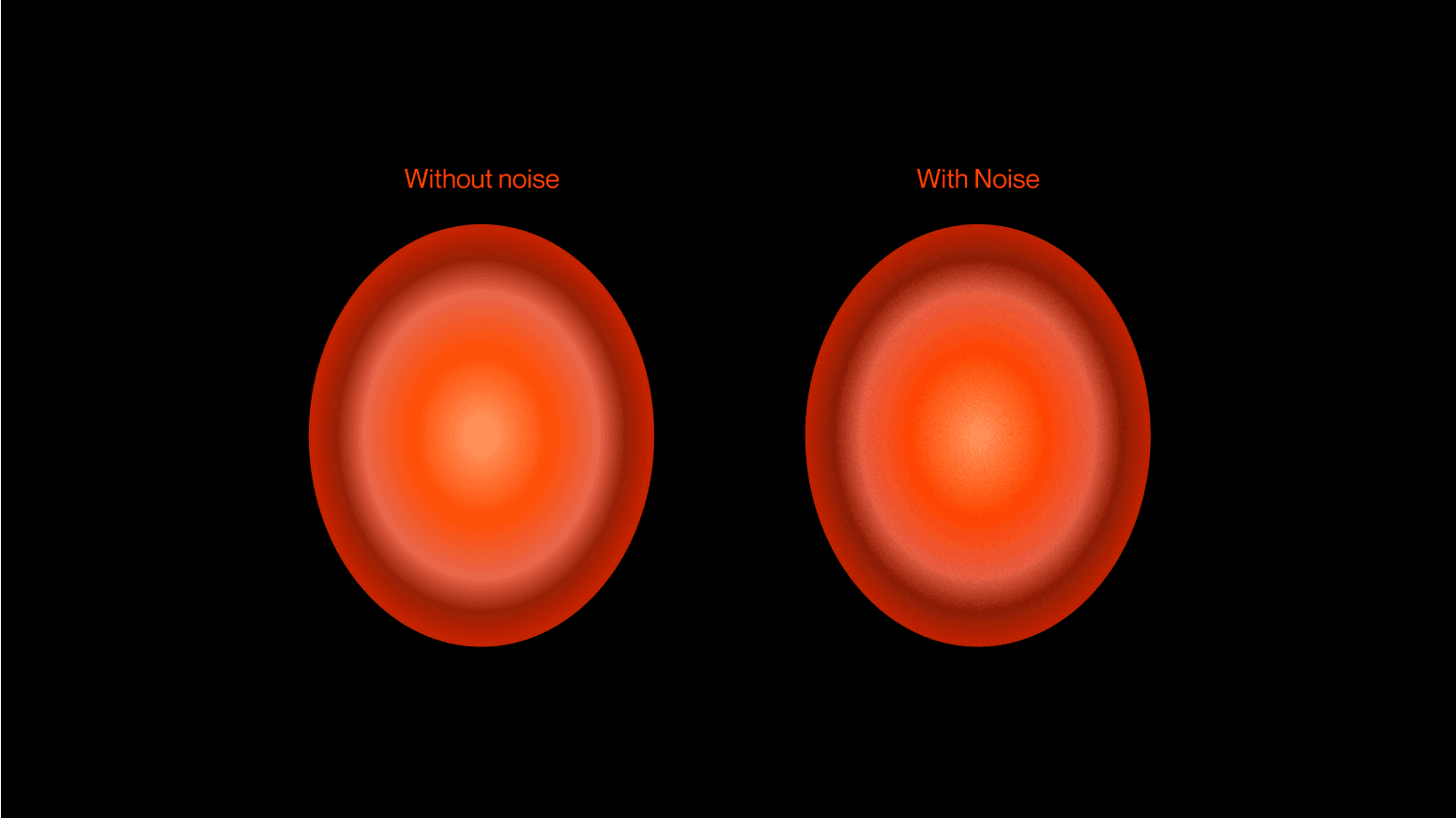
Adding noise to gradients
To add some grain, you’ll need to look for some noise PNG on the web, put it on top of your gradient, and set it to overlay. However, in today's landscape, plugins can be used as well. If you love Figma like us, there is a banger from Rogie: The Noise and Texture Plugin comes with many different customizable noises that update in real-time.
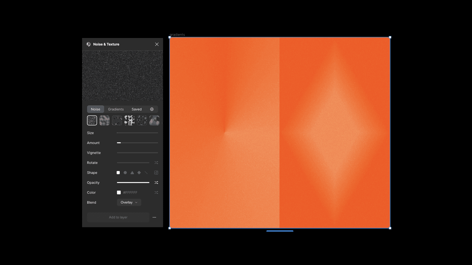
Noise & Texture Figma Plugin
Crafting custom gradients
Using default settings is a good starting point, but why not have some fun and craft your own? You can create custom gradients in a more hands-on way. Try mixing vector shapes with blur effects and see what cool stuff you can come up with. Let’s see some examples:
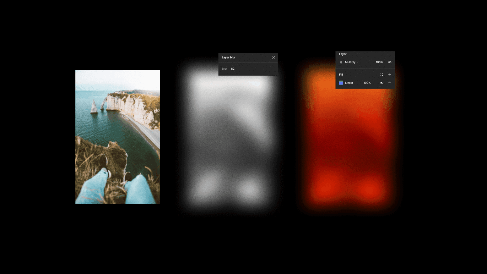
Using the layer blur effect
To make something really custom, try using the blur effect on layers - it can lead to some really unique and beautiful results. Start by picking some geometric shapes, or just doodle whatever you like.
Once you have your elements, smush them close together and play around with the blur settings - try tweaking it up to around 100. The blur gain depends on the size of your layers, and don't be shy with colors; test out different ones to see which blend well together.
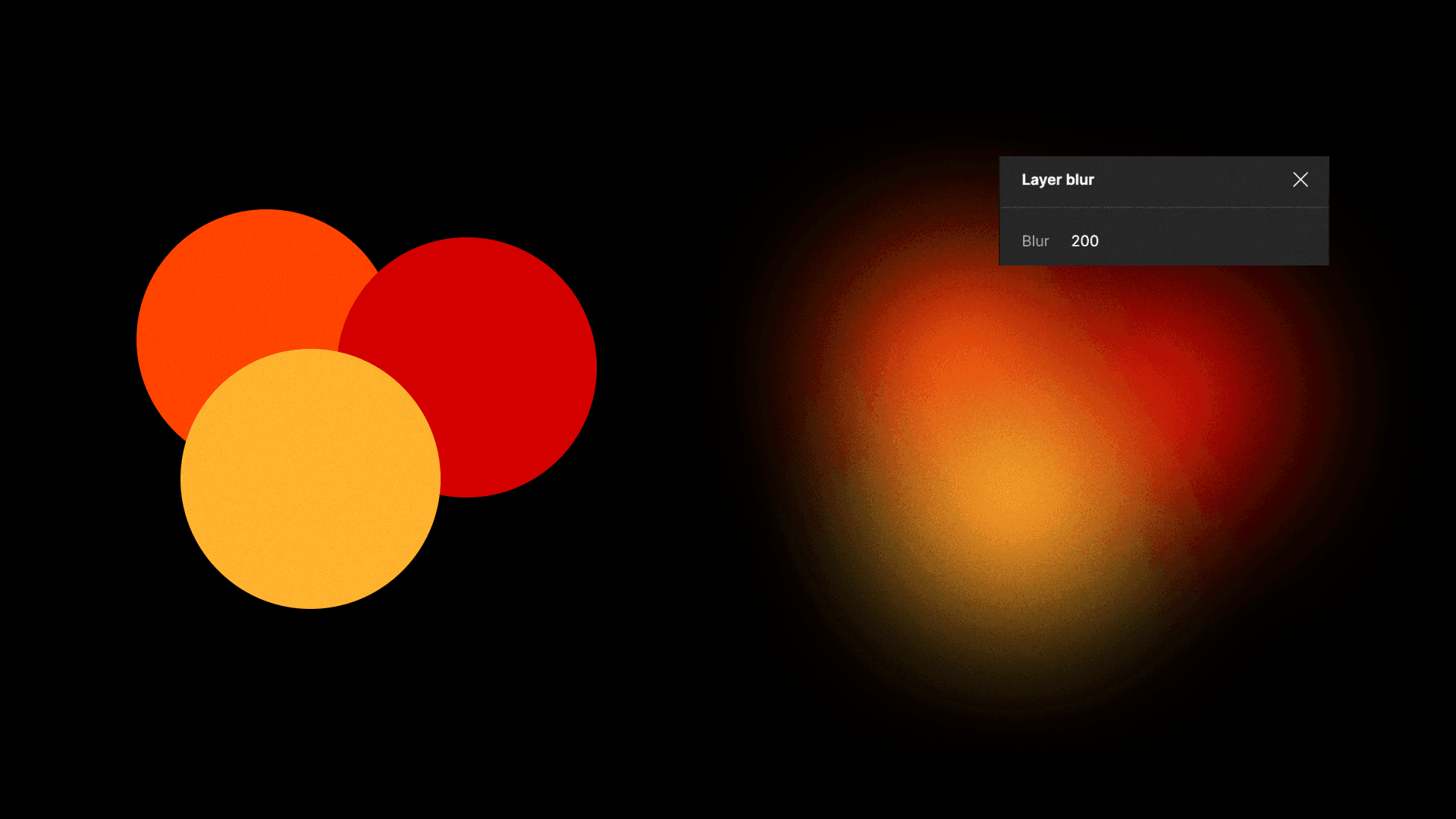
Layer blur effect
To spice up the Figma tools, it's nice to add layer blur to radial gradients, too. Give it a go by tweaking the values to induce a harmonious blend. Yet, tread with care; it's easy to tip the balance. If you push the boundaries too far, the original intended colors may meld excessively with the background, leading to an unintended outcome.
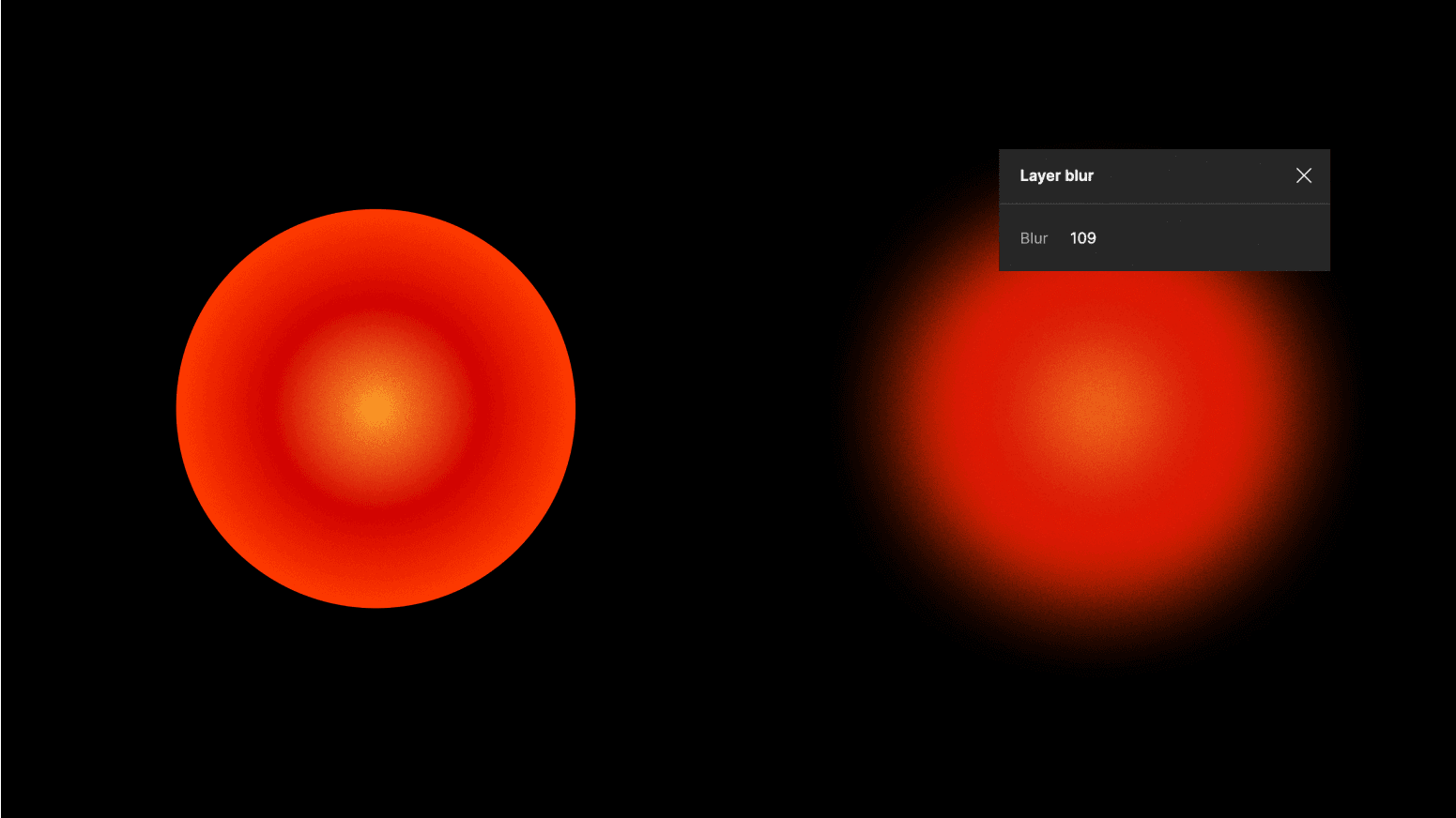
Adding blur to radial gradients
Using the background blur effect
Rather than blurring each individual element, make a single shape to seamlessly meld everything behind it. Start by crafting a shape that effectively covers the targeted area for blurring. Apply a subtle gray shade to the shape and tone down the opacity slightly. Plop this shape over the area you want to blend, and then introduce a background blur. Keep in mind that depending on the background color, different shades of grey can either hide or highlight the blended shape.
You could also add some subtle hue and saturation values to the mix to influence the overall color profile and get a warmer or cooler profile through this approach.
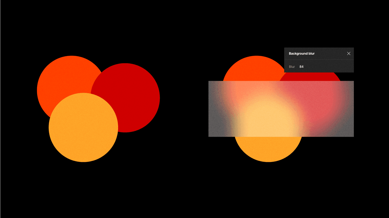
background blur effect
Using layer blur on images
To keep those experiments rolling, try adding a layer blur to an image - it looks better in grayscale. This technique creates some unique textures. And guess what? If you slap a gradient on top, it will look stunning!
Layer blur in photos
Figma plugins to the rescue
We're lucky to live in an era where tools are getting so powerful, all thanks to the contributions of users who chip their ideas. Many of the hands-on techniques we've discussed here have also been tackled by creators within the Figma Community. Isn't that awesome? Let's delve into a few of these gems:
Gradient Figma plugins
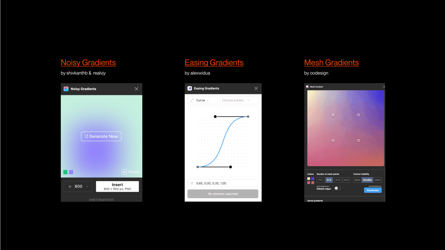
Noisy Gradients It's a simple yet beautiful solution that uses an algorithm to generate random colorful gradients, similar to the manual approach we previously explained (the layer blur method). You can achieve thousands of varying results and draw inspiration throughout the process. Moreover, this plugin even grants you the possibility to add noise when necessary and allows the export of the final product in PNG format.
Easing Gradients Create smooth gradient transitions with cubic easing functions. This is a powerful plugin to ease the values of a given gradient fill, which means getting fine-grain control in its smoothness by handling custom cubic-bézier or step-easing functions in a handy UI. This is especially useful when dealing with transparent gradients and allows for creative exploration.
Mesh Gradients Rather than manually placing shapes on a plane and then blending them with layer blur, this plugin provides a simple interface to adjust the vertices and edges of a mesh. It emulates the powerful free-form or "mesh" gradient tool found in Illustrator.
Don't Stop the Fun
Remember, gradients aren't just for filling shapes—they're an excellent resource for jazzing up borders, lines, text, and shadows. Just let your ideas run wild and scour for inspiration. We have a bunch of websites featuring gradients’ usage in pretty subtle ways.
Don't be shy to mess around with the values, and don't stop at just a few layers. Double up on the fun by copying your composition and layering it with different blending modes like overlay, multiply, or those other funky effects that might seem a bit intimidating. But hey, don't sweat it! It's all about trying different things and having a blast while doing it.


