- Client
 Baseten
 - Year2025
- Type
Visual BrandingWebsites & Features
- Linkwww.baseten.co
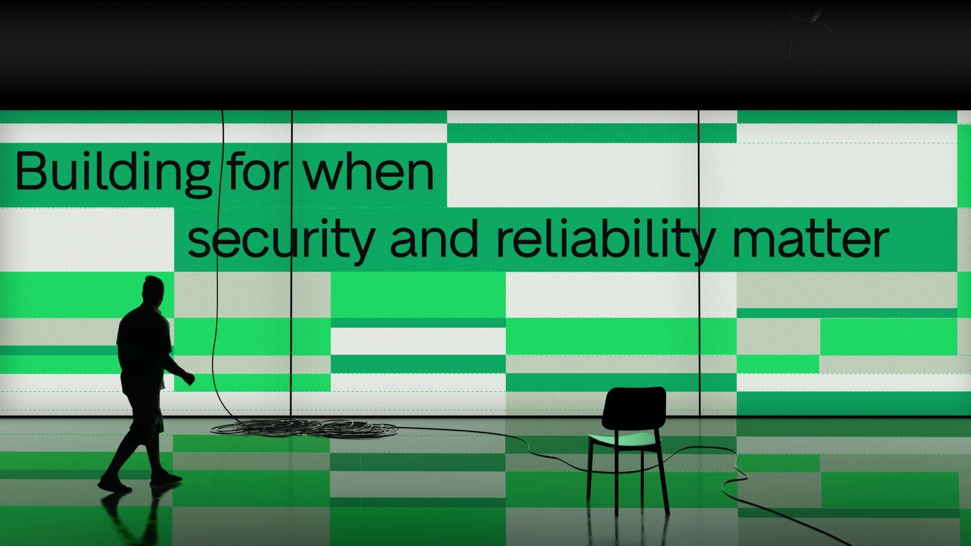
Baseten is at the center of the AI boom, helping companies deploy and optimize their own models across any cloud. As the product matured and adoption grew, the company was entering a new stage: one where credibility, differentiation, and consistency mattered as much as technical strength. The problem was the brand stayed static while the company scaled. Assets felt scattered, the abstract “B” logo carried little meaning, and there was no system to unify how Baseten showed up across product, marketing, & events. For a company competing against giants, this lack of cohesion was more than a design issue, it was holding back the business.
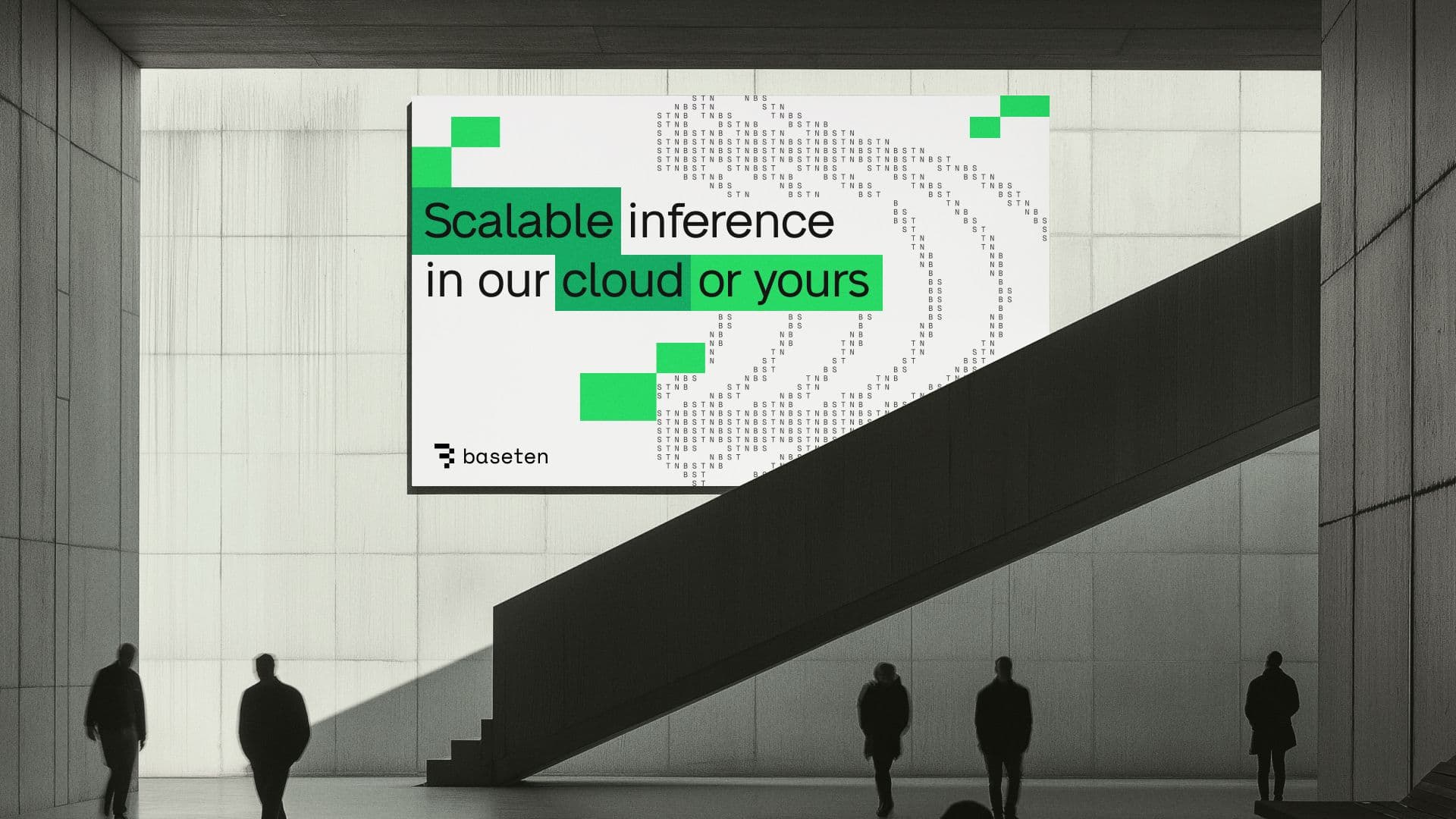
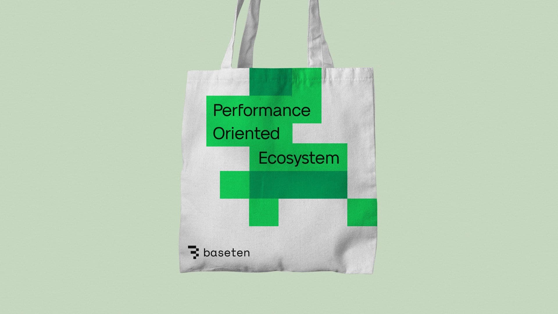
So we rebuilt the brand like infrastructure itself: block by block. ASCII patterns gave a wink to developer culture, the new block system symbolized scalability (Base Ten, remember?), and a refreshed palette pushed their green brighter with a hit of pink to make it fresher. Because even infra deserves a little glow-up.