Nostalgia. The 90s. Cool typefaces. Retro games. Oh! You guessed it right. We are at basement and here we have fun and grow by experimenting a lot. Let’s talk about fonts!
In our design squad, we're all about weekly challenges to spice things up and level up our skills. Last year, the idea of experimenting with making a cool typeface hit us, and the whole team was on board. I was excited. Diving into the world of typography for the first time was bound to be a wild learning experience. If you're looking for this venture, I'm here to share my process. Hint: display and modular fonts are the way to go. Ready for the making of Adhesion?

Thinking in squares
So, the game plan was to cook up a modular typeface. That means working on the reticular modulation of spaces, which allows for optimizing time in the completion of any construction, task, or project. Since these fonts are like LEGO blocks, you can break them down, rearrange them, and repurpose them for all sorts of creative gigs.

To kick off the journey, I scoured for inspo and references that spoke to me. I threw together a mood board that vibed with gothic and pixelated fonts, giving off a mix of old-school feels and modern vibes. It felt like I could craft something intriguing without plunging into the advanced theories demanded by heavyweight fonts.

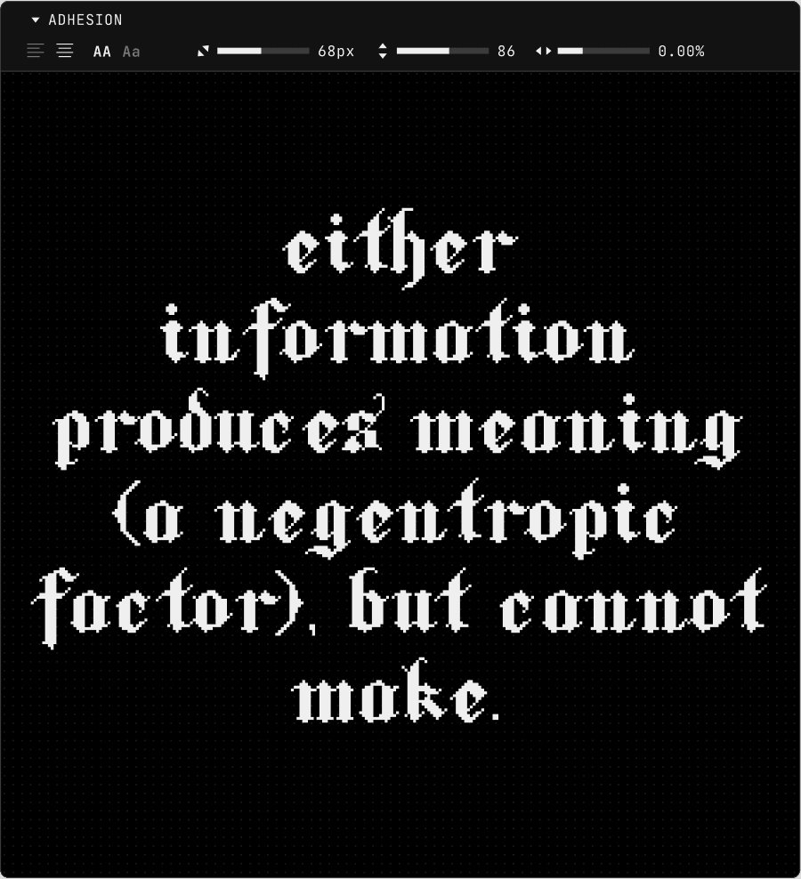
So, I opted for simplicity, starting with squares as the letters' building blocks and thinking about combining old black letter references and pixel fonts. Given that the traditional style was crafted by hand using calligraphic techniques, translating those organic forms into a meticulous grid of perfect squares posed a delightful challenge.
Setting the grid: A font with a resolution
Next up: creating a grid. I started sketching it out by hand, channeling old-school blackletter styles. But soon, I ditched the paper for digital because, let's be real, copy-paste is a game-changer for tweaking things.
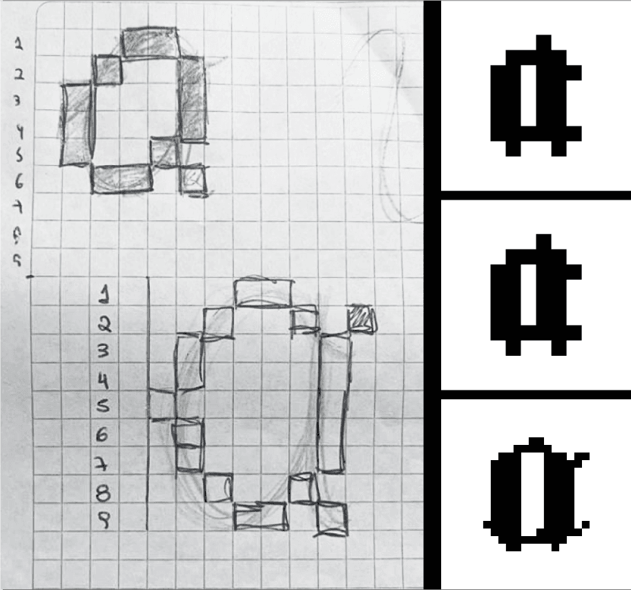
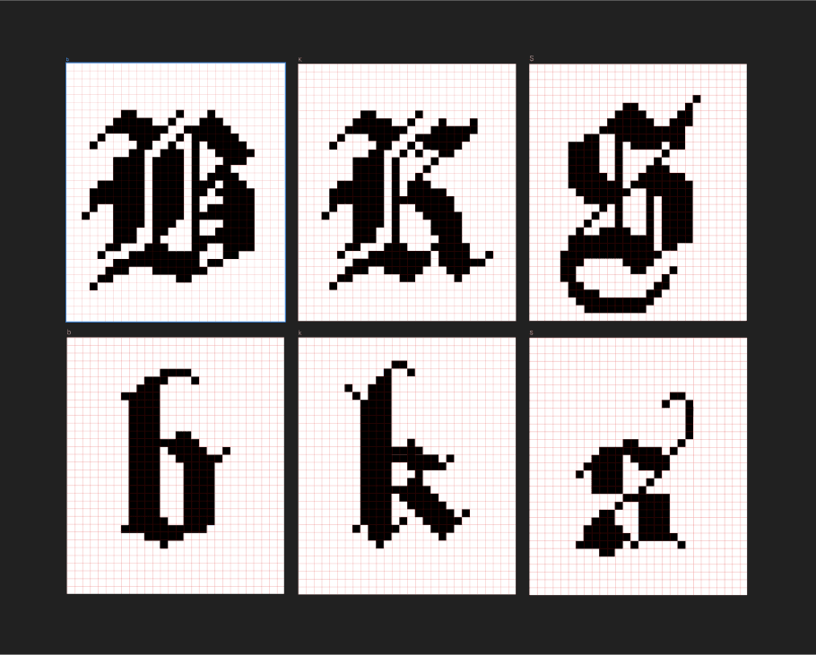
Lettering in blackletter typefaces has a highly stylized appearance rooted in medieval, classic calligraphy. The letterforms are often dense with flourishing ascenders and caps. While some characters were relatively easy, getting those organic curves with pixels threw me for a loop. After some tests, I realized that switching from a small pixel grid to a beefier 30x30 was a game changer. More pixels, more control, more finesse.
The challenging parts
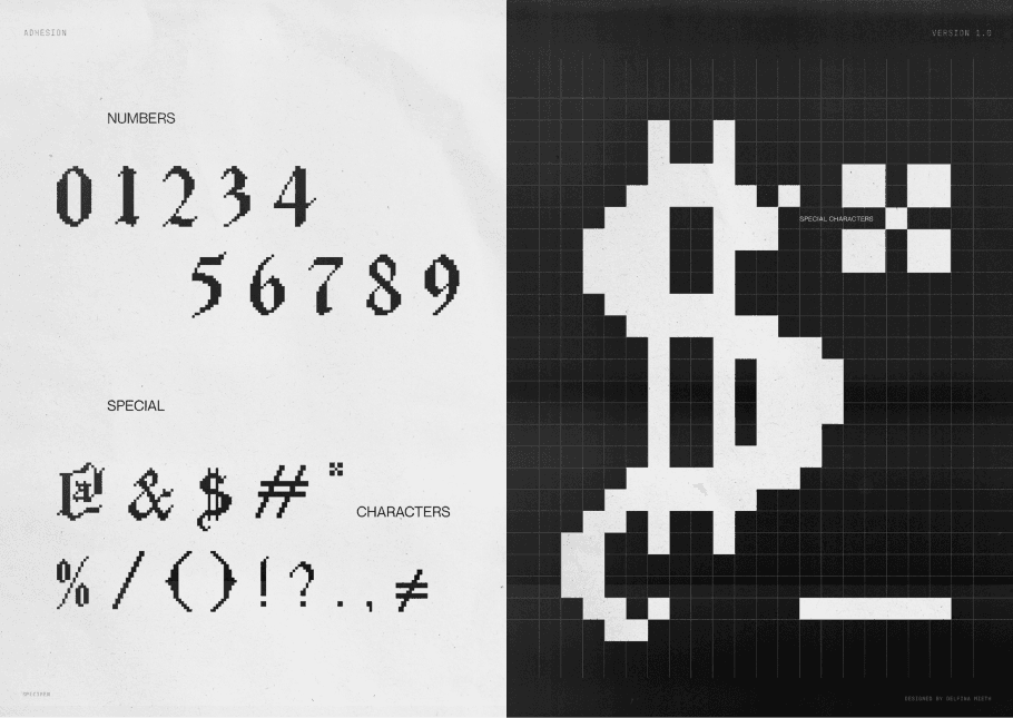
Numbers and special characters posed a real head-scratcher since I lacked handy references. However, this forced me to dive deep into the intricacies, conducting trials and errors until I finally hit a sweet spot.
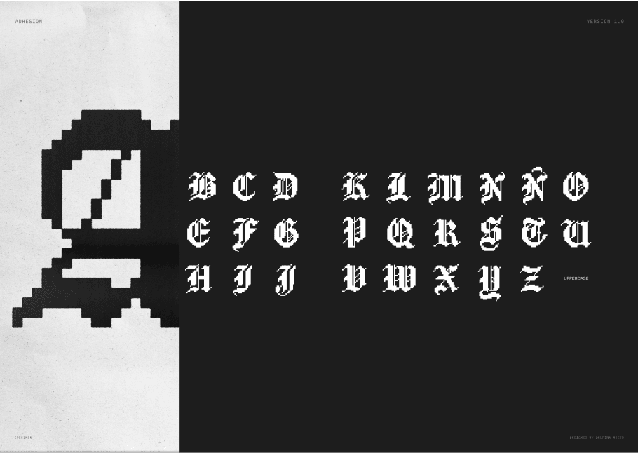
On the flip side, lowercase characters seemed deceptively straightforward. Yet, once I had them locked and loaded, the uppercase counterparts breezed in effortlessly. I believe I achieved a better outcome with those capital letters.
However, the ultimate hurdle? Putting the thing to the test. When I started composing words, I began noticing details and misalignments everywhere. Seeing it in action on the system highlighted issues that couldn't be addressed one by one.
Having fun: creating a universe for your font
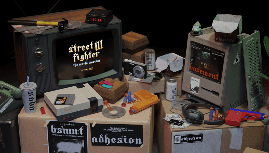
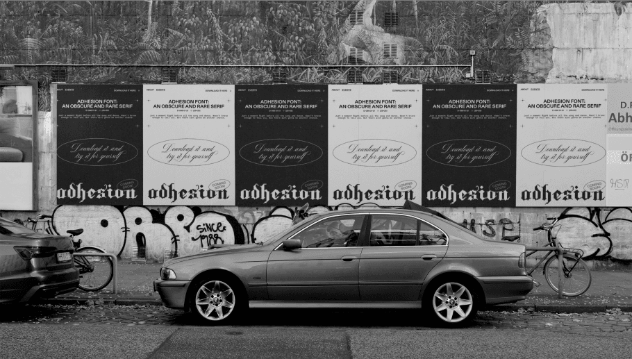
Now, here's where my inner nostalgia buff took the lead. For the website graphics, I drew inspiration from old-school rave flyers and 90s posters – the golden age of raves. Think black and white, photocopies, and script fonts. We even teamed up with the 3D wizards to sprinkle some retro magic on the typography, throwing in 90s objects and creating a whole environment to share the font in use with the world.
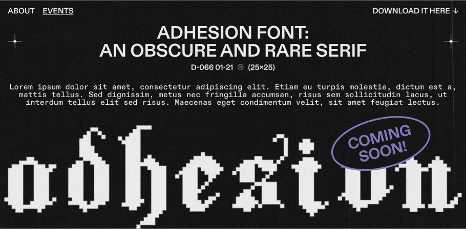
Oh, almost slipped my mind! While I was busy building the font, I also had to come up with a name. After some pondering (not too serious, I promise), I landed on Adhesion. Why? Well, besides sounding cool, it's a nod to one of the go-to words for font testing. It perfectly sums up a bunch of shapes that let folks quickly catch the vibe of the typeface in the making.
Conclusions
This ride made me appreciate typography on a whole new level. Now, when I spot those font super-families, I can peek behind the curtain and get why they're built the way they are.
Even the most straightforward font needs to keep its cool. It's like diving into a complex design system where everything's interconnected. This whole gig was a throwback to the basics, a deep dive into the design principles I once nerded out about in my design degree.
The best part is that typefaces tend to be an ongoing work in progress. I know there's some fine-tuning to do—kerning, and a few characters acting up. But hey, it's a journey, not a destination. So, keep tuned for upcoming versions of this baby!
Not an average font shop
Ok. But where to find Adhesion? You can visit our web catalog, where our design team poured his curiosity into making something cool. Every font beautifully merges the personal touch with artistic explorations from different members of our visually-focused departments.
We hope you enjoy our website, basement foundry isn’t just about fonts. It's about a team of passionate builders—designers, developers, and 3D artists—breaking boundaries and creating magic. Remember, this is not your average font shop :)

