A look behind the scenes of the website built for Basement Grotesque, the open-source typeface of basement.studio.
Basement Grotesque is one of basement studio’s first self-initiated projects. We wanted to create a typeface tailored to the studio’s visual language. It became the perfect excuse to show it off with a website that could suit its inherent bold and striking style.
The Beginnings
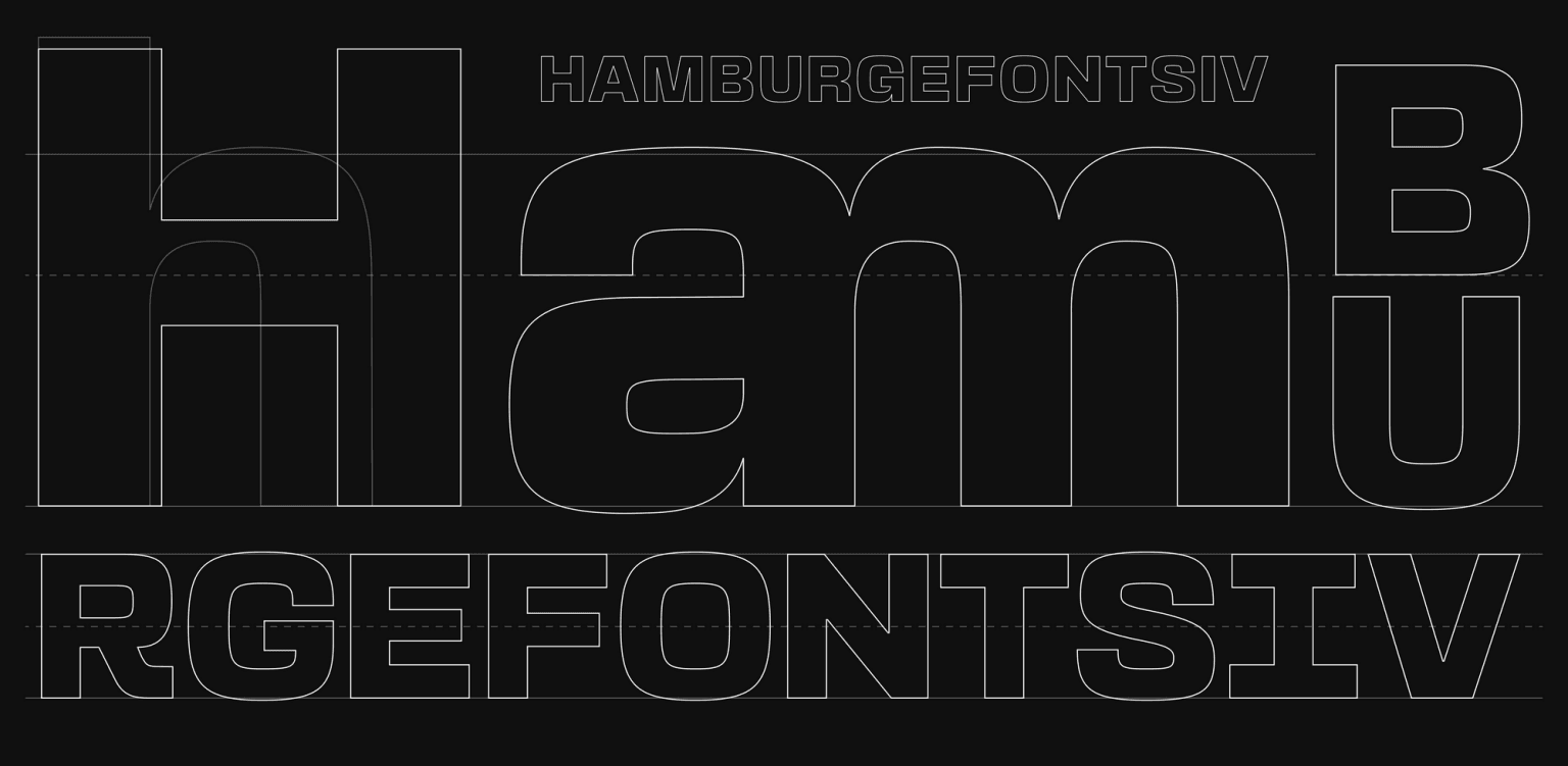
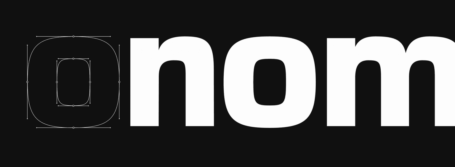
Our design team had just redesigned the studio’s identity. For the wordmark, instead of using an existing font, we decided to draw each of the characters in an effort to capture the distinct voice and style of the studio. Once we had drawn those final seven letters (and the period sign), it seemed only natural to expand them to a full-fledged bespoke font. That was the beginning of Basement Grotesque.
From then on, our task was fairly clear: we had to create a strong typeface, suitable for large headings and titling, and it had to be bold. Inspired by the specimens of grotesque typefaces of the early 19th century, and combining them with the renewed brutalist aesthetics of the contemporary visual landscape, Basement Grotesque would become our first venture into the daunting world of type design. We weren’t just designing and releasing a new font; we were on the journey of learning a new craft by doing.
Coincidentally, the studio had established quarterly hackathons to devote specific time and space to develop self-initiated projects where the whole team would get together, work on and ship anything we wanted to explore and test that wouldn’t normally be possible with client work. After some brainstorming, the first project chosen for our first hackathon was the site to launch and share our first typeface. Again, it just felt like a natural decision.
This font is really the result of a creative itch we wanted to scratch a long time ago. We took on the challenge and now we have a growing typeface, open and available to anyone who wants to use it.
Andres Briganti
Head of Design
The Process
Once the goal was set, the challenge was to finish at least one weight of the typeface and then make a website to promote it and its future additions. We had to do something captivating so that it would motivate our community to use it and share it.
The font quickly reached a stage where it was advanced enough to be released. Part of the appeal of the project was the idea of creating something that was an ongoing effort and a work in progress. New weights and widths, and even revisions and updates would become available and open to the public as time goes by.
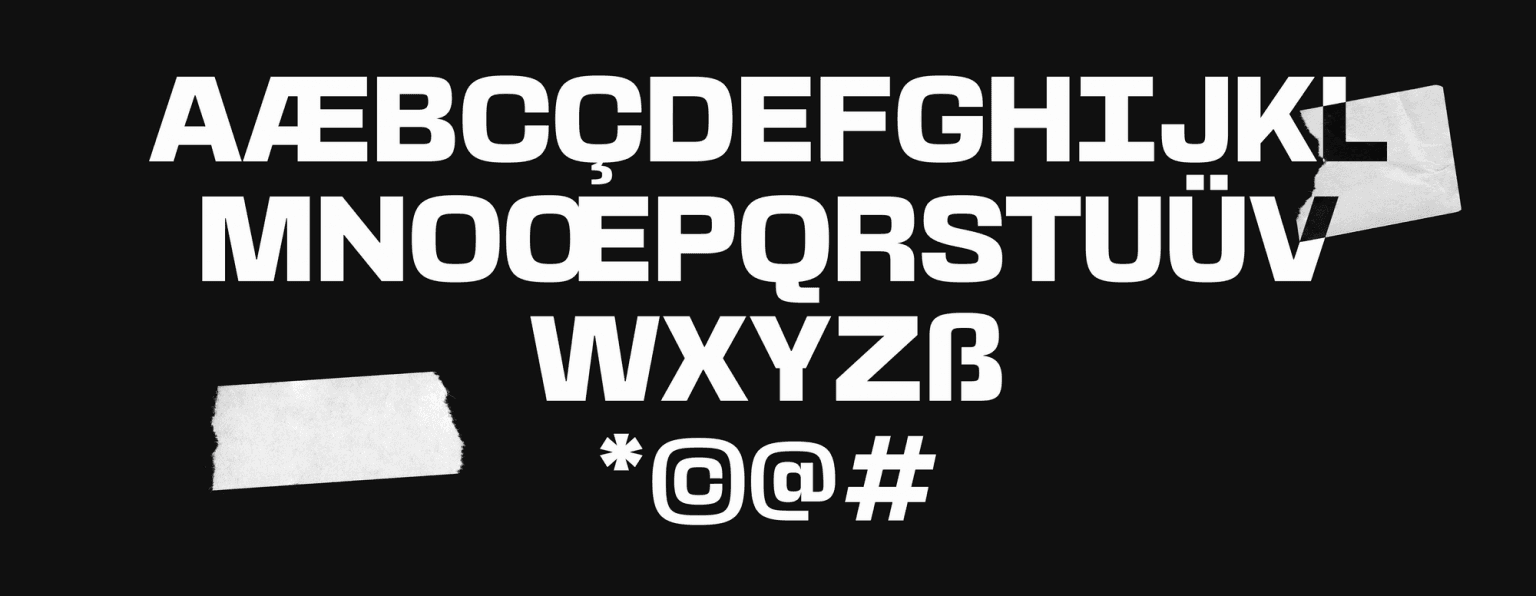
Starting with the Black Weight (800), each character was carefully designed to convey the studio’s visual style, and some of the features of the current version are:
413 unique glyphs
14 discretionary ligatures
Bold, our voice and tone, of course
Old style and lining figures
Language support for Western and Central European languages
Create, Develop and Show Off
With the font in hand, we now had to build a website to present it. It had to be interactive enough to show the typeface’s features, but also feel solid and performant.
The preferred tech stack at basement is Next.js with TypeScript. Having those as basics, we then chose GSAP for animations, Stitches for CSS-in-JS, and Locomotive Scroll for better scrolling experiences — among other libraries. We started from a template repository, next-typescript, for faster development.
We worked on a tight deadline, and the team really delivered. Each of us worked on a specific section, and then we arranged everything together to get to the final result.
Julián Benegas
Head of Development
The repository was made open-source, so feel free to fork and play around with it: https://github.com/basementstudio/basement-grotesque.
Interesting Code Challenges
1) In the “Try this beauty” section, we have an interactive preview, where you can adjust the font size, leading, and tracking, to see how it looks. We had to create a ResizableTextarea component to solve some spacing issues. The syncHeights function synced the height of a placeholder div with the actual textarea node. A bit hacky!
11 function syncHeights(textarea: HTMLTextAreaElement, div: HTMLDivElement) {
22 const value = textarea.value.replace(/\n/g, '<br>')
33 div.innerHTML = value + '<br style="line-height: 3px;">'
44 div.style.display = 'block'
55 textarea.style.height = div.offsetHeight + 'px'
66 div.style.display = 'none'
77 }
Full source here.
2) On the footer, we used the 2d physics library p2.js to get that cool “falling letters” animation. The code is a bit long, but please, feel free to follow the source from here.
3) We integrated with Twitter’s API to get and render tweets hashtagged #basementgrotesque on the website. On the download flow, we suggested that users tweet something to show some love 🖤
11 const handleDownload = useCallback(() => {
22 const encoded = {
33 text: encodeURIComponent(
44 'I’m downloading the #basementgrotesque typeface, the boldest font I’ll ever use on my side-projects. Thank you guys @basementstudio 🏴 Get it now: https://grotesque.basement.studio/'
55 )
66 }
77 window.open(
88 `https://twitter.com/intent/tweet?text=${encoded.text}`,
99 '_blank'
1010 )
1111 download(
1212 encodeURI(location.origin + '/BasementGrotesque-Black_v1.202.zip')
1313 )
1414 }, [])
Full source here.
The Results
See it for yourself: https://grotesque.basement.studio/.
The code is open-source: https://github.com/basementstudio/basement-grotesque.
Note
This article was originally published on Codrops.

